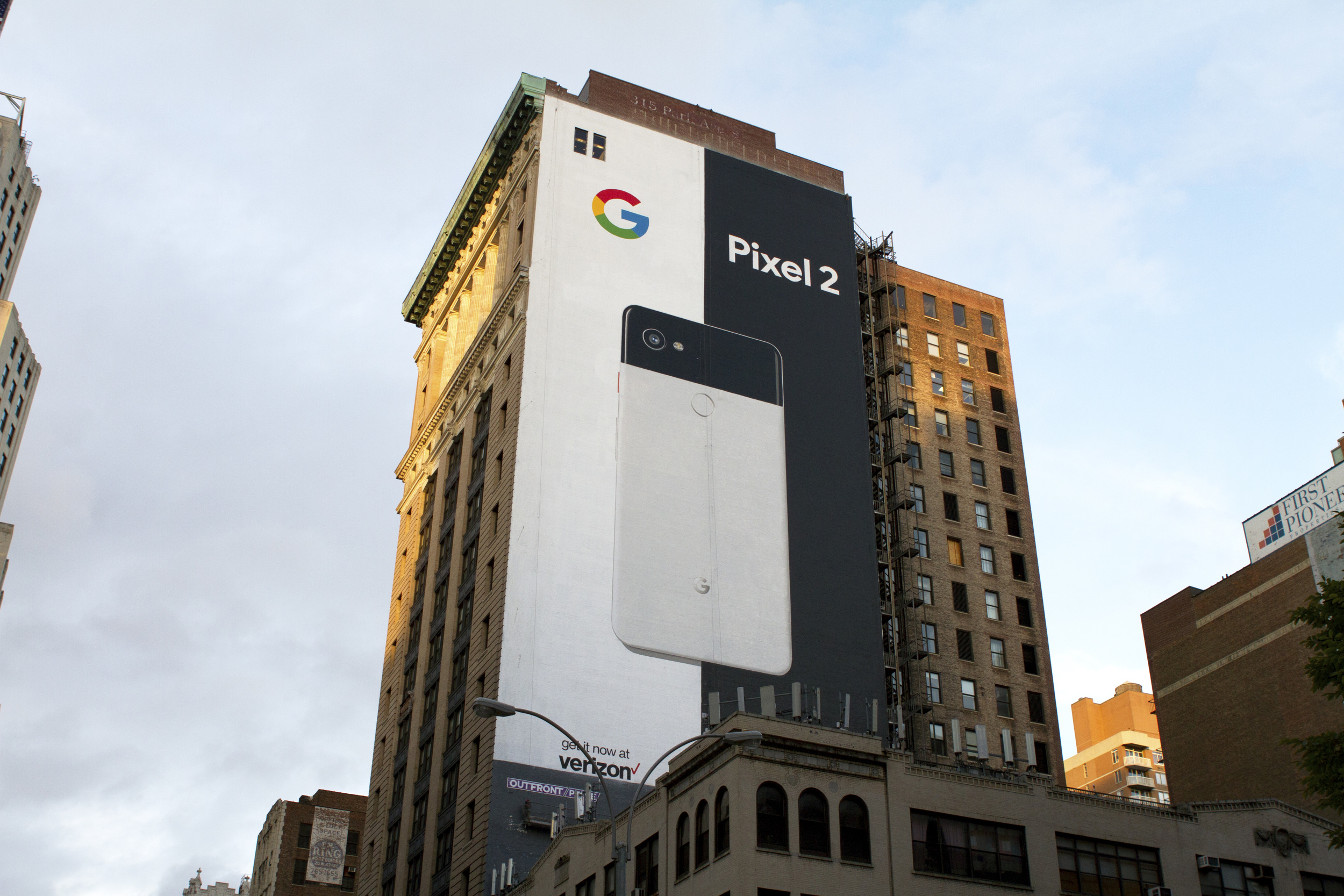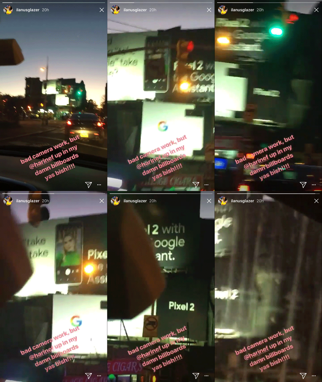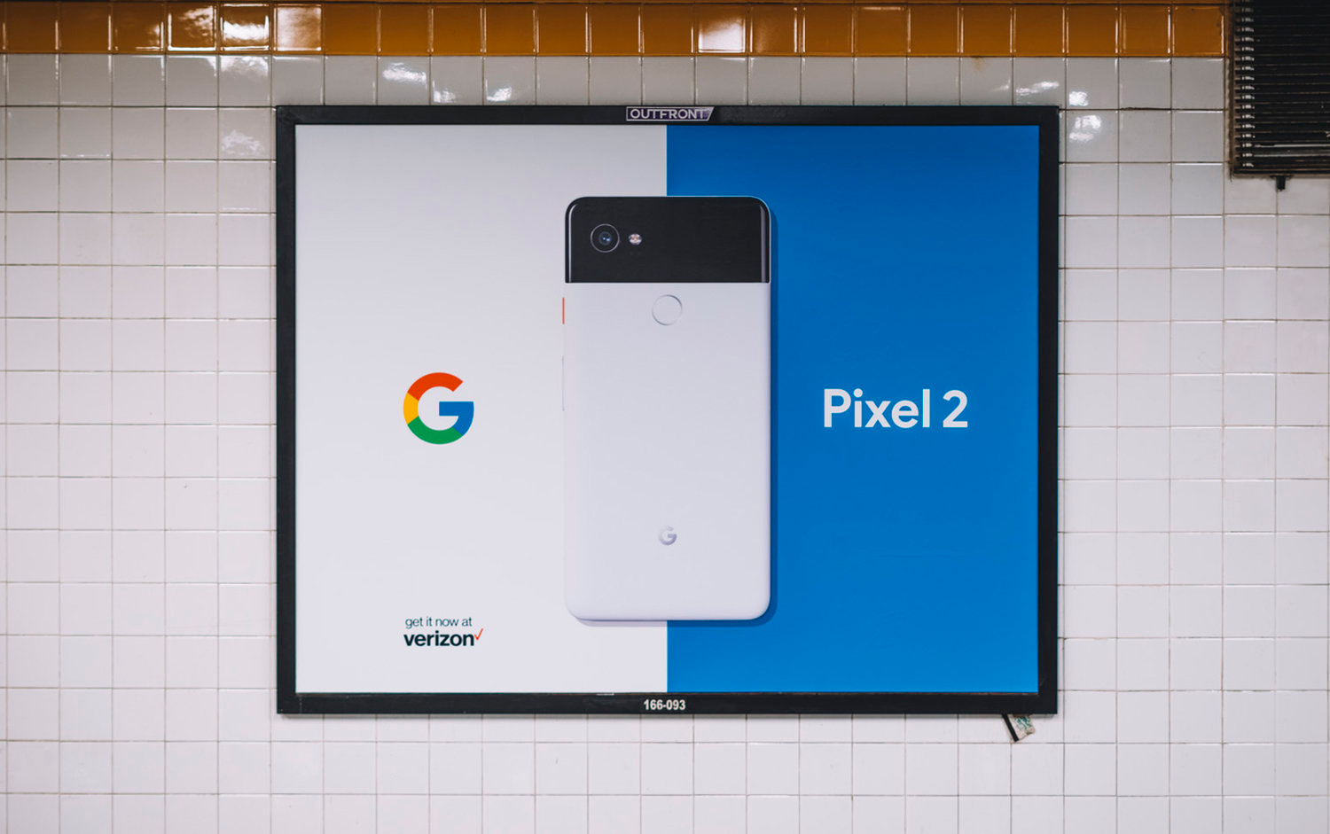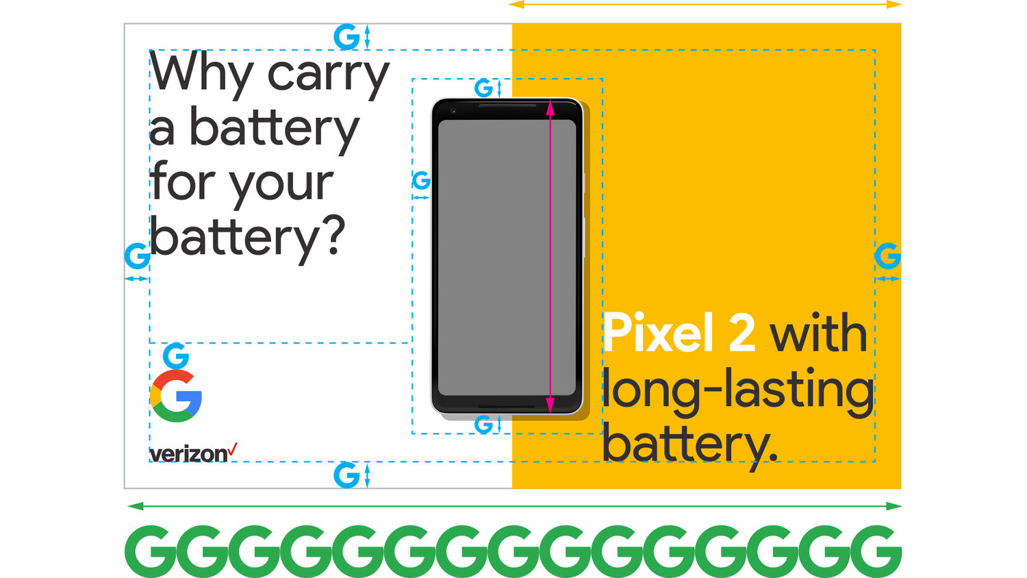

Design direction for global Google Pixel 2 OOH and print campaign.
Tasked with creating a disctinctive, yet on-brand look for Google, the visual system inspired is by responsive web design for mobile. Hardware is front and centre, with key messaging scaled to fill all available negative space.
As seen in the first Pixel 1 launch, Google has traditionally avoided large areas of color use, which is now seen as a clearly identifiable aspect of their brand.
Droga5 design team:
Jake Tieman, Kathryn Brylinsky, Eli Hochberg


