Branding and identity for Travel Agent chain.
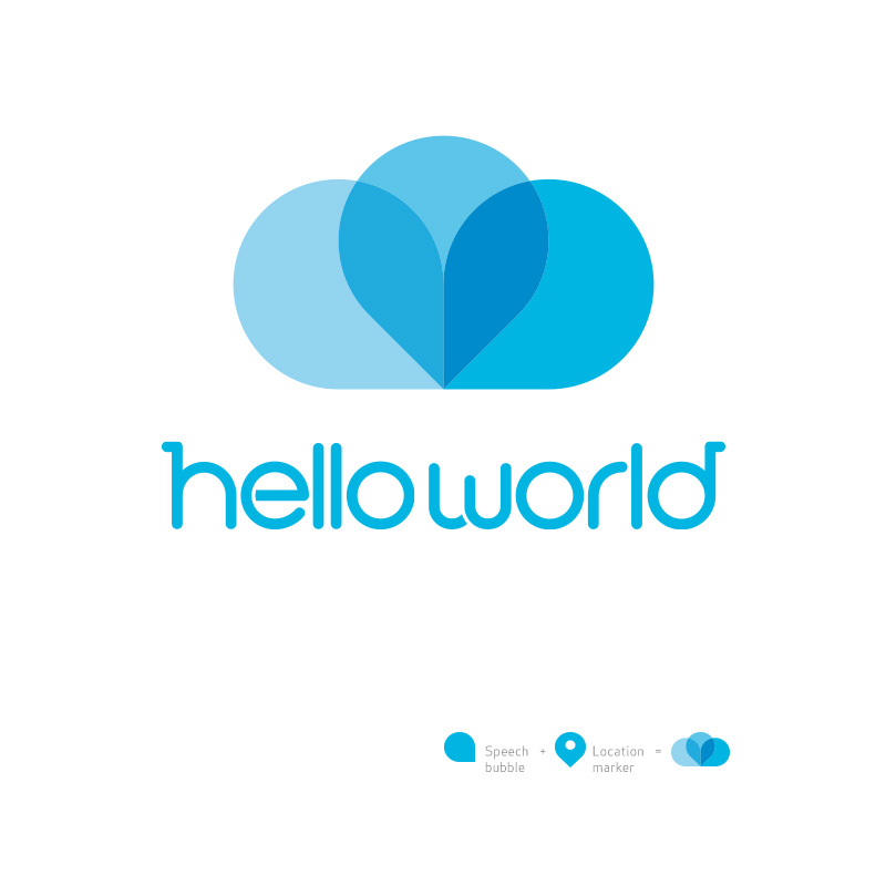
In a literal sense, the logo was formed from two speech bubbles (a conversation) and a location marker.
Whilst also resembling a drifting cloud and a love heart, it evokes calm and relaxing dreams of vacation to create a contemporary, friendly, clean and bold brand.
A completely custom sans serif logotype was designed to convey warmth and informality with selected slab serifs to give a sense of credibility and establishment.
Logo design, custom typography and brand Creative direction by Michael Kleinman.
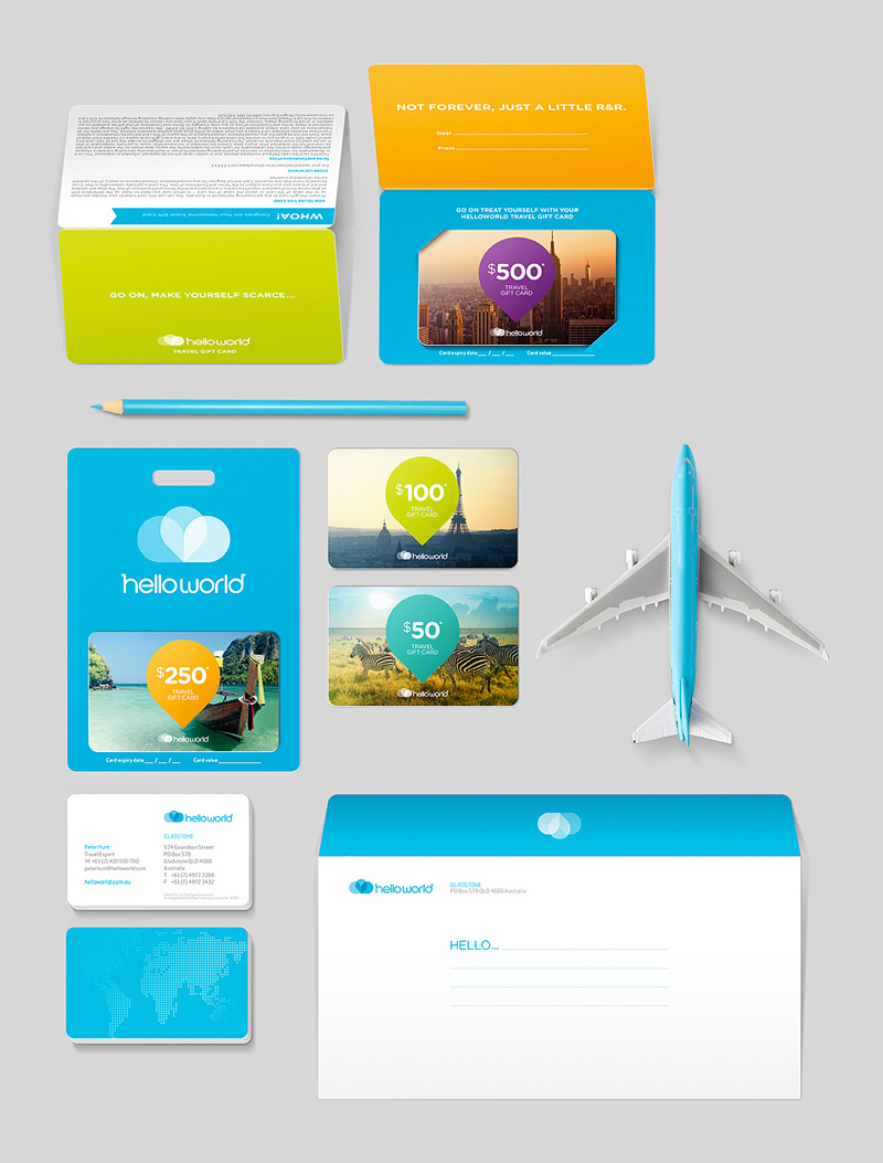
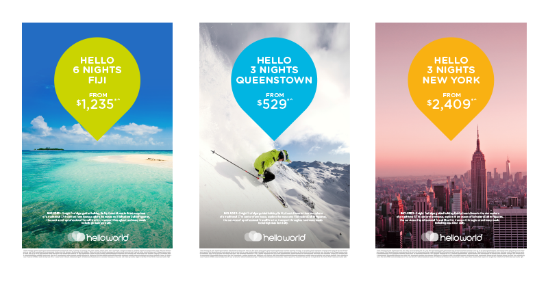
Print material designed by Duro Cubrillo.
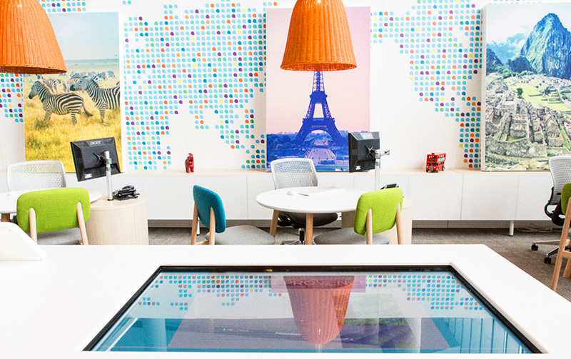
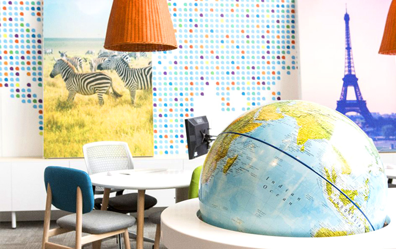
Store design by Greater Group.
Client: Droga5 Sydney for helloworld